

Produkty promocyjkne
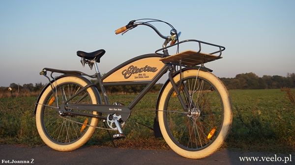
151-Delivery-600x335.JPG
131-Boney-Finger-600x335.JPG
http://veelo.pl/images/Produkty_Promo/131-Boney-Finger-600x335.JPG
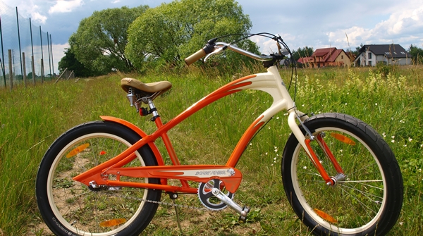
112-Lakaster-600x335.JPG
http://veelo.pl/images/Produkty_Promo/112-Lakaster-600x335.JPG
ROW199-Swing.JPG
http://veelo.pl/images/Grafiki/Zdjecia_do_Artykolow/ROW199-Swing.JPG
ROW160-Rockabilly-Boogy-865.JPG
http://veelo.pl/images/Grafiki/Zdjecia_do_Artykolow/ROW160-Rockabilly-Boogy-865.JPG
ROW155-Double-Daiamond.JPG
http://veelo.pl/images/Grafiki/Zdjecia_do_Artykolow/ROW155-Double-Daiamond.JPG
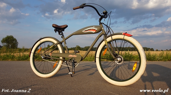
ROW154-Shark.JPG
http://veelo.pl/images/Grafiki/Zdjecia_do_Artykolow/ROW154-Shark.JPG
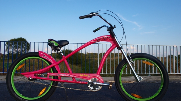
071-Rat-Fink-600x335.jpg
http://veelo.pl/images/Produkty_Promo/071-Rat-Fink-600x335.jpg
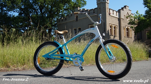
Electra Double Diamond
Cena 10161 zł
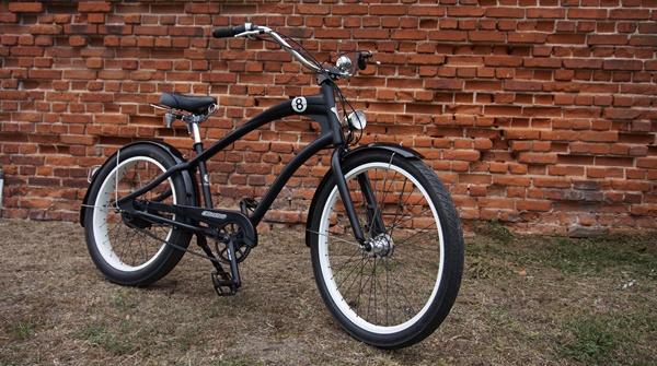
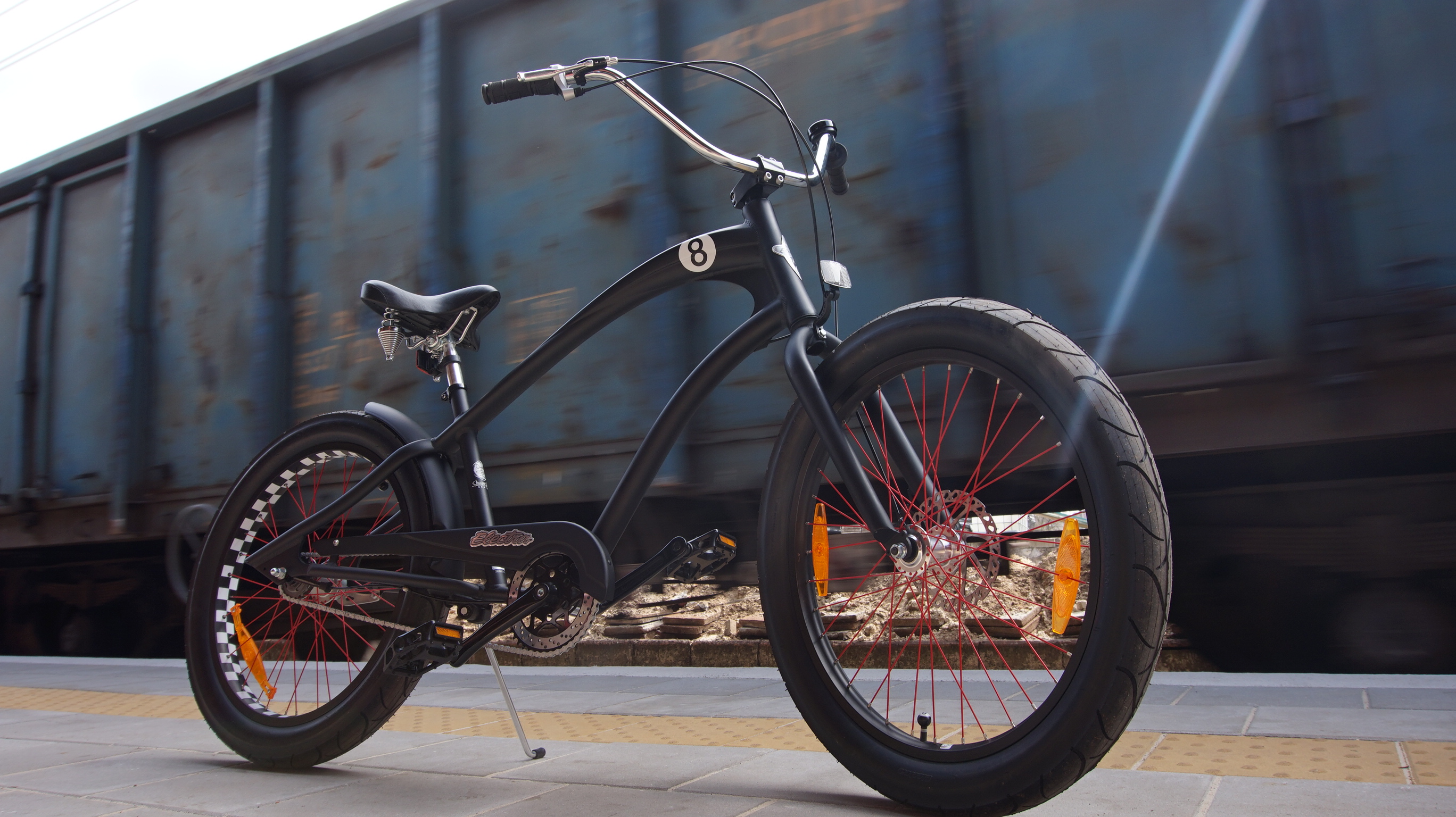
Electra Straight 8
Cena 3399 zł
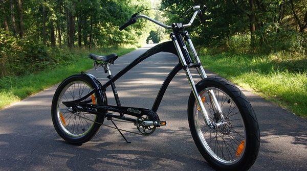
Electra Ghostrider
Cena 2690 zł
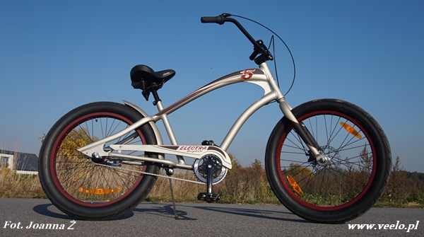
Electra Fast 5 3 i
Cena 2599 zł
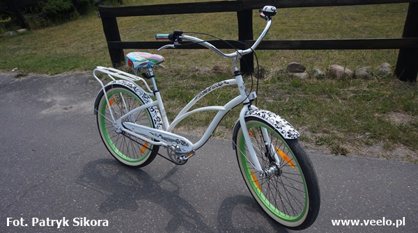
Electra Blanc
Cena 2100 zł
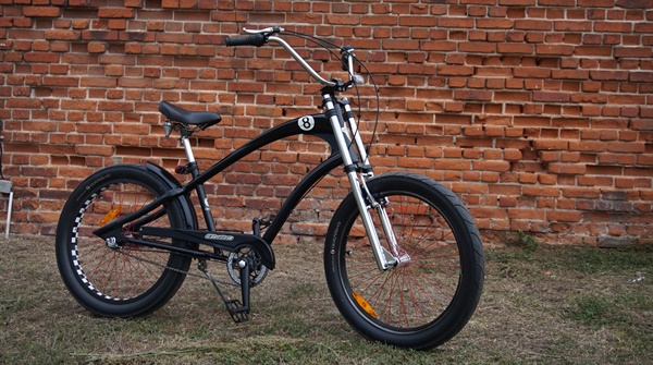
Electra Straight 8
Cena 2699 zł
Polecane Produkty
pokaż wszystkie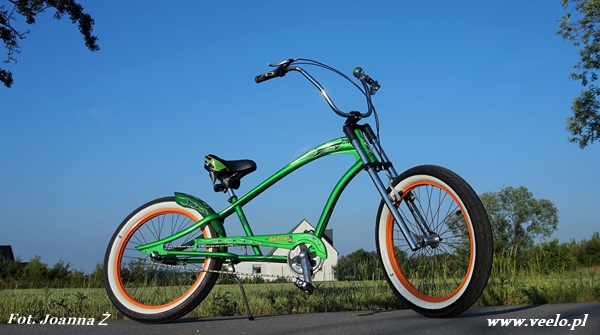
(ROW223) Electra Rat Fink
Cena 2499 zł
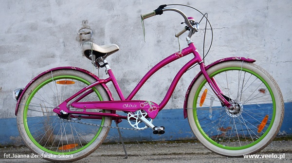
(ROW236) Electra Cherie
Cena 2199 zł
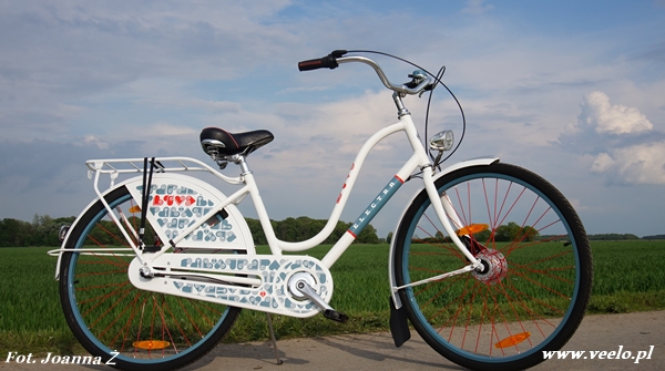
(ROW181) Electra Fashion Love 3 i
Cena 2099 zł
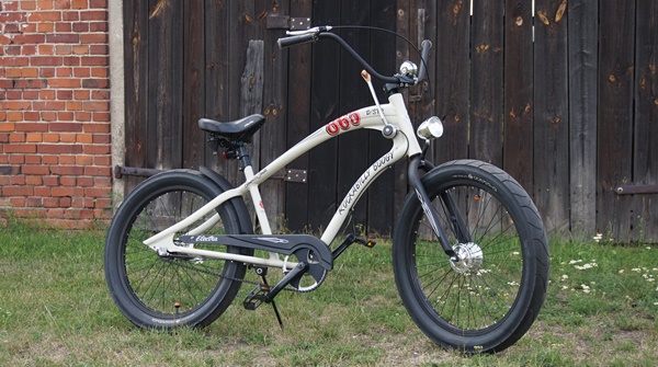
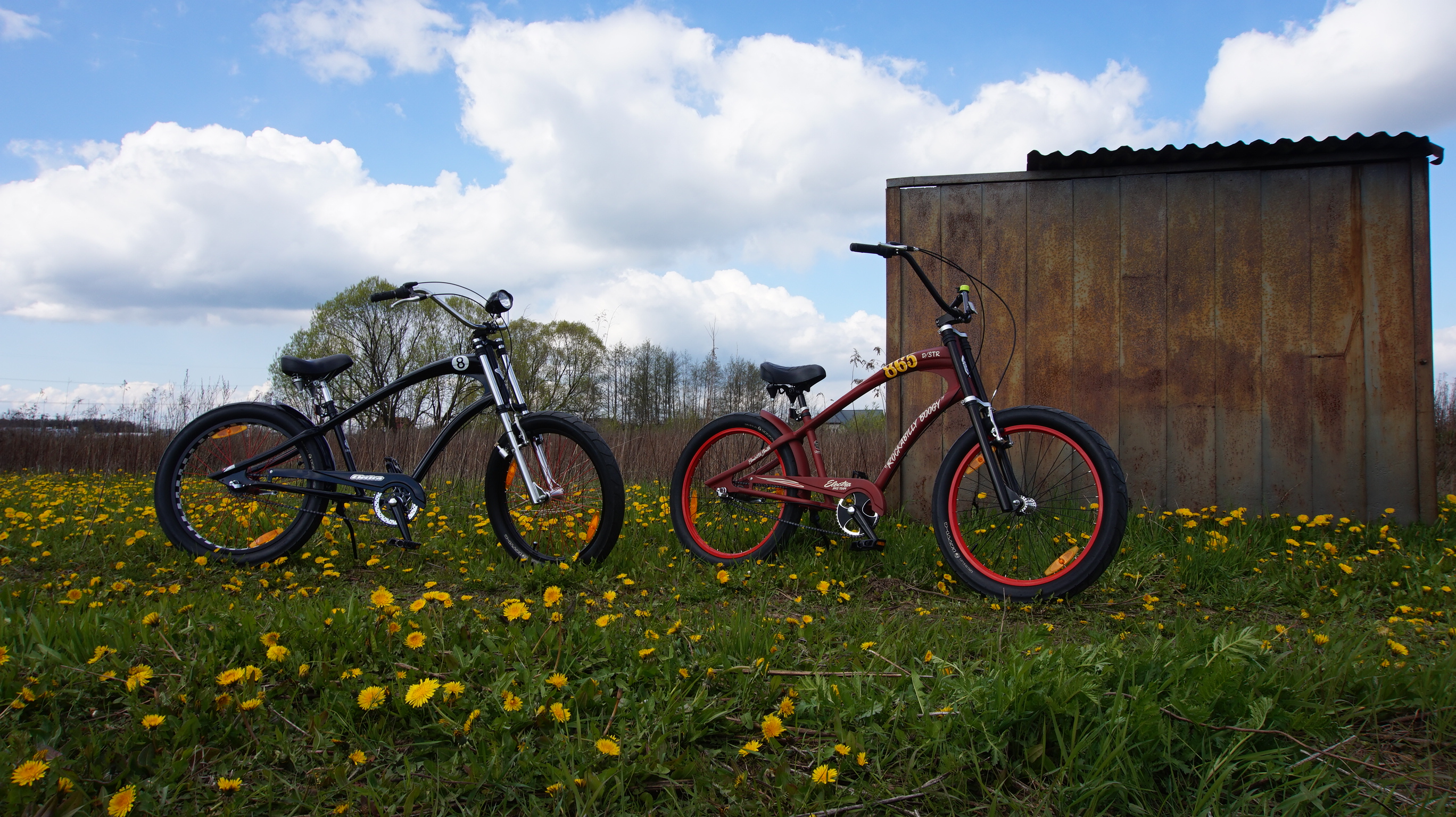
(ROW243) Electra Rockabilly Boogy
Cena 2499 zł
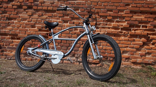
(ROW242) Electra Rally Sport
Cena 1799 zł
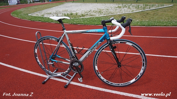
(ROW190) Orbea Asphaly Shimano 105
Cena 2099 zł
Template Details
-
All JoomlaShine templates are equipped with native RTL layout support. We spent huge amount of time tweaking every tiny details of the template to make it look absolutely awesome in RTL mode. Everything is horizontally-flipped including dropdown main menu and side menu.

(Select any menu item to get back to normal layout)
-
In our templates all wordings of both back-end and front-end are moved to separated language files, so you can easily translate them into any language you want.
Interactive images presentation by JSN ImageShow extension
-
Please be aware that the responsive design is available only in the template version for Joomla 2.5
All JoomlaShine.com templates have special built-in design optimized for modern mobile devices iPhone, Android and Windows Mobile-based.
Unlike other template providers, we do not develop something that looks like a mobile app with heavy menu and animation. We built compact and lightweight version of the template preserving the whole original look-and-feel.
Mobile layout overview on Iphone

Mobile layout overview

Module positions in mobile layout
Mobile layout has 8 dedicated module positions, where you can show modules specifically designed for mobile edition. Additionally, you can use template parameter Position Mapping to present modules from regular positions in mobile positions.
Mobile layout overveiw on Ipad

Mobile layout overview on Ipad

Desktop layout overview on Ipad
Optimized HTML overrides for mobile

Article presentation (com_content)

News feeds presentation (com_newsfeeds)
We optimized HTML overrides for all default Joomla! extensions to make them looks neat in mobile edition. The work is mainly focused on rearrangement content from columns to rows.
Optimized menu for mobile
For mobile edition, we have built very simple, yet effective menu system, where all children menu items are presented as tree in collapsible panel. This menu system utilizes only little Javascript (MooTool) for expanding/collapsing submenu panels and is very fast and lightweight.

Special designed mobile menu system

Children menu items are presented as tree
You just need to put the menu module to mobile position mainmenu-m and it will automatically obtain appropriate look-n-feel. All module settings are the same as for regular main menu. Additionally, you can use template parameter Position Mapping to present menu module from regular position mainmenu in mobile position mainmenu-m.
Mobile Menu with icons and rich text
The most amazing thing is mobile menu inherits all the goodies of regular menu like icons and rich text.
Mobile menu with icons applied

Mobile menu with rich text
The mobile feature is enabled on live demo. You can see in real time how the template works on your mobile device.

Rowery

Veelo to My
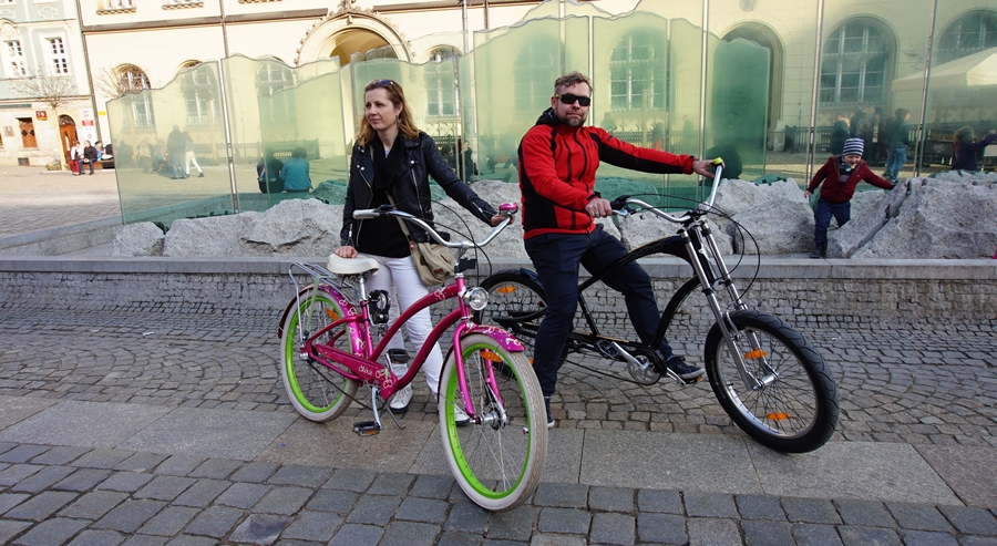
Na początku chcieli byśmy przywitać wszystkich którzy postanowili odwiedzić naszą skromną stronkę...
Więcej…